Showing posts with label #digital manipulation. Show all posts
Wednesday, 5 March 2014
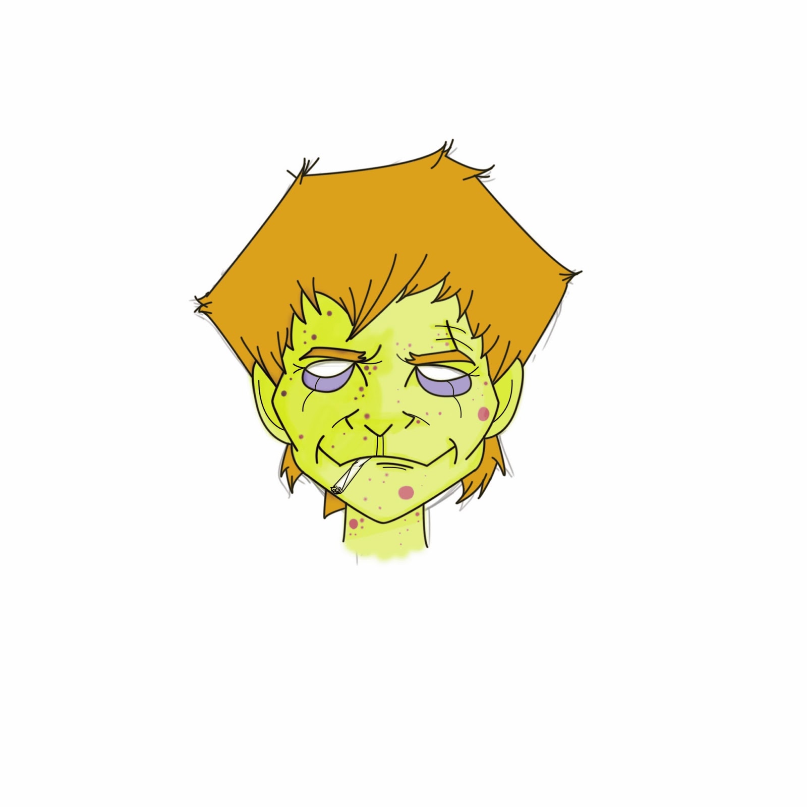
Narrative Illustration ( Rentz, Sickboy & Spud )
This is a piece I have been working on lately with three of my main characters.. it is unfinished and the background I have added is purely for the aesthetics of this post.
I plan to use the characters from this piece to illustrate a very disturbing and saddening part in the book in which 'Baby Dawn' dies. The reader finds out by 'Sickboy's' reaction that the baby was his.
As the characters stand over the baby's crib, 'Sickboy' rolls up his sleeves and demands that he is stopping taking heroin for good.. so this image is going to eventually communicate this event in the book.
Tuesday, 4 March 2014
Rents Prep to Kick Heroin Illustration (Narrative Illustration)
This is a double page illustration concept for my narrative illustration unit on which I have chosen to do Irvine Welsh's Trainspotting.
This illustrates one of the first few chapters in the book in which 'Rentz' has decided to try to kick his heroin habit, he has a carefully put together plan listing all the things he will need to do so.
He mentions at one point after proudly ticking off the items in his list, that he will just need 'one more hit' to help him get over the first night... unfortunately for him this proves ridiculously troublesome and things take a humorous and disappointing twist.
So this illustration is basically showing 'Rentz' picturing himself carrying out his ideal plan with all of his drug kicking necessities .. I just felt that putting emphasis on his plan to get one last hit, would set up the reader for a bigger fall when he does not manage to get his last 'hit'.
At the moment I am still playing about with colours, hues, saturation etc until I am happy with the image, here are some that I have completed so far. ..
Wednesday, 26 February 2014
Trainspotting Cover idea (Narrative Illustration)
Still in progress.....
I have had an idea for the cover of the book pretty much since we started this unit.
I want to show a semi-accurate display of the vascular system in the forearm, expressing the damage done to the veins from heroin abuse.
I made a point of my piece NOT looking like an anatomical drawing as this would not fit with the style I will show throughout the rest of my work.
I also don't want the piece to have any kind of "shock horror erughh look at those scabs" quality.
I want my viewers to notice the wounded veins but not be distressed by them, representative of the outlook of the characters taking heroin...They are aware of the damage they are doing to their bodies, but are having too much of a 'good time' to really care.
So Ill try to keep a composition thats fun, and nice to look at.. whilst also going into slightly crude detail on the more sensitive parts of the piece (the veins).
Below are the processes and steps I have taken so far in tackling this obstacle...
I have had an idea for the cover of the book pretty much since we started this unit.
I want to show a semi-accurate display of the vascular system in the forearm, expressing the damage done to the veins from heroin abuse.
I made a point of my piece NOT looking like an anatomical drawing as this would not fit with the style I will show throughout the rest of my work.
I also don't want the piece to have any kind of "shock horror erughh look at those scabs" quality.
I want my viewers to notice the wounded veins but not be distressed by them, representative of the outlook of the characters taking heroin...They are aware of the damage they are doing to their bodies, but are having too much of a 'good time' to really care.
So Ill try to keep a composition thats fun, and nice to look at.. whilst also going into slightly crude detail on the more sensitive parts of the piece (the veins).
Below are the processes and steps I have taken so far in tackling this obstacle...
First Image Crit
My first Image for the Narrative Illustration brief.
This image, or a very similar image will be used for the front cover ( wrap around).
Im going to keep experimenting with this image until im totally happy with it.
Wednesday, 19 February 2014
Renton Digital 2
This is my second digital drawing of my main character Mark Renton.
With this piece I experimented with with different types of line, using different brush strokes on photoshop. I experimented with line colour, background colour and tone with ( I think ) a very relaxed attitude towards the outcome of my actions.
I took inspiration from Marcos Chin for this piece, I have researched him before for the digital manipulation unit and have further researched him since.
I think I will use a similar image for my wrap around.
Renton Digital 1
I thought I'd try out drawing my first character digitally to see how it looked compared to my hand drawn images.
I Think the benefits of doing it this way out-weigh the hand drawn versions.
I like the line quality I can achieve with the different brush strokes on photoshop, the colours are much more definite and smooth and I can more easily achieve the look im going for this way.
Monday, 25 November 2013
Loosely Inspired by Marcos Chin
Amy told me about an artist called Marcos Chin, and mentioned it might be useful for me to take inspiration from his work... specifically the line work.
First of all after looking at his work I really like it. I found an image that I really like and another photo of Iggy Pop by Annie Leibovitz, of which would be the basic of my character in the piece.
He's in good shape for his age yah?
I started with a elongated landscape canvas, because I wanted my piece to be somewhat panoramic.
I set my reference images up on the adjacent screen to work from.
I started by using a very fine and soft brush tool to sketch out, as best I could the body of my character taking reference from the Iggy Pop photo.
Using the magic wand tool, I very loosely selected sections of the body and in separate layers I coloured them. I did it loose because although I really like the work of Marcos Chin, I wanted to add my own abstract style to my piece.
I then added a layer for the background, placing it behind all of the others. Using reference from the Chin piece I coloured it accordingly, however using different colours as I like to use more vibrancy and noise in my work.
I lined my character using the pen tool and stroke path combination, I added tone, and small details to start to build up the base of my character.
Then, taking inspiration from the Chin piece I used a fine brush on the brush tool to sketch in my interpretation of the plants used on my reference.. in this case I drew a few tattoo style roses. I did this because with me using Iggy Pops body, and the colours, I could foresee this piece having a rock'n'roll style theme.
After drawing the roses, I shaded and blended the surrounding areas.

I didn't want my roses to be as delicate as the flowers used in Chins piece because i felt it wouldn't fit the theme of mine. So I used a collection of non specific filters to sharpen them, darken them and add more texture to them to bring them forward slightly from the background.
I then played with the Hue, Saturation, Contrast and colours of the image until I found a theme that felt right.
I added certain filters to the body of my character to round off and finish the tone work and detail I had drawn into it.
I then researched jewish symbols and prison style tattoos that i felt were appropriate for my character, I wanted to give the impression of anger, violence and passion so I gave him a WW2 jewish number tattoo on his forearm to show the idea of vengeance.
I knew of a great quote by Ghandi, and I really wanted to incorporate this into my piece so I chose a suitable font, colour and size and placed it somewhere that I felt looked right.
Once I was finished with the main body of my piece I placed it over a background I had created with the gradient tool the frame the piece.
I am happy with it.
Christopher Walken
The Deer Hunter is one of my favourite films. It stars my two favourite actors Robert De Niro and Christopher Walken. So I wanted to do a piece on the infamous roulette scene with Christopher walken and try to do him justice.
I started by finding a suitable frame from the film.
I added a new layer above the image and carefully lined the details using the pen tool and stoke path combination.
This was the outcome.
Using the magic wand tool to isolate the certain areas, I coloured and toned the image using the brush tool and the blend tool.
This was how it looked after i had completed colouring and adding tone to my piece.
I used separate layers to colour most sections of the character, this way I could keep good control and not colour outside my line work.
Using the Film Grain filter, and added noise and texture to the character.
I felt the image was too wide and there would be too much empty space. Empty space can be useful sometimes to communicate a certain feeling, but with this piece I wanted the viewer to focus on the main character of the piece and show that this was all about 'what was going on in his head'. So I cropped the image suitably.
Using the Brush tool I added a colour theme to the background.
I added a filter to round the shape paths and block the colours in a certain way to give a wooden feel.
I then added another filter to add noise and texture to the background. I wanted it to feel as busy as it is in the scene of the film, but also keep the focus on Walken and draw no attention away from him. So i kept the colours quite tertiary and dark.
After completing my background, I used the lasso tool to loosely map around the edges od my character...
I used this to then lighten the space behind him, bringing him further forward form the background again. Also I feel this effect looks quite abstract, which was my intention as the rest of the piece is fairly abstract and the emotions felt whilst watching this scene are also somewhat bizarre.
I would of been happy with my final outcome, but I feel now if I was to do it again I could do it a lot better given the skills I have picked up digitally during this project.
Sailor Jerry inspired Weed Tattoo Design
I wanted this piece to look as much like a piece of Sailor Jerry flash as possible. To do this I chose one of his pieces I like most and referred to it constantly throughout my processes.
This was the piece of Sailor Jerry flash I referred to.
I started with a basic picture of a piece of marijuanna that I felt looked easy to work with on photoshop.
I heightened the contrast and saturation so that the flower stood out from the background more, this was to make it easy to cut out with the magnetic lasso tool.
After cutting it out and adding it to a new layer I was now left with just the flower, which was all i wanted.
I added a basic paint effect filter to simplify the colours, this was semi-pointless as I eventually filled it with a block colour anyway. But it did give me a clearer indication as to what colour I should use.
On the Sailor Jerry piece and most other Sailor Jerry pieces the image was drawn on a really nice, grainy, old effect brown paper. So I found something similar using GoogleImages and opened it in photoshop.
I added a Film Grain effect to the paper to give it more texture, similar
to the one i was referencing.
After filling the flower with a block, pale green colour, I lined it using the pen tool and stoke path combination like my previous piece.
I used a soft brush tool with a basic black colour to shade the image, trying to keep my shading as similar as possible to my reference.
I blended out my shading roughly to fit the theme.
After the shading, I added the same Film Grain filter I used on the paper background so that everything had the same texture.. so that the flower actually looked as though it was drawn on to the paper.
I added some basic detail to the flower, to make it look more like a marijuanna flower.
Using the pen tool, I started to add a scroll to the piece. This will eventually read the message, " I love you Mary Jane". Referencing a song by Cypress Hill, a song famously about the love of marijuanna.
http://www.youtube.com/watch?v=7-ADAr9-Aqs
I filled the scroll with a colour, and shading similar to those used throughout Sailor Jerry's flash pieces.
I added a sphere behind the piece, for no other reason than I like to do this. I like how it looks. I think its nice. Its nice... right?
I added the same film grain filter to the sphere so that it matched the rest of the piece.
Changed the colour of the sphere.
I was going to use the text tool and a font to fill the scroll with my desired message. Unfortunately there was no font suitable or nice enough in my opinion to fit the bill, so I used the brush tool and a solid black line to draw the letters in manually trying to keep it as similar as possible to my reference piece.
Over all I am very happy with the finished piece. I feel that by trying to keep the piece as similar as I could to my reference photo, I achieved what I wanted to and the piece turned out great.
Subscribe to:
Posts (Atom)


.png)

.png)
.png)
.png)
.png)
.png)
.png)

.png)
.png)
.png)
.png)

.png)
.png)
.png)
.png)
.png)

.png)
.png)


.png)
.png)

.png)
.png)
.png)


.png)
.png)
.png)

.png)
.png)
.png)
.png)

.png)